
A new chapter for IKIGAI
The story behind our new identity
If you've been to one of our studios recently, or followed us on Instagram, you might have noticed something changing.
IKIGAI has a new look: a new symbol, new colours, and a new typeface. We want to share a bit about how it came together.
The early days
When we opened IKIGAI, we were young, had less experience and a lot of creative ideas. We did most things ourselves and learned lessons along the way.
The two of us have always worked differently, but in a complementary way. Aymeric likes getting his hands on things and building systems from the ground up himself. Gianni prefers finding the right people and bringing out their potential.
Over the years, this balance helped shape IKIGAI into what it is today. Each time we reimagined one of our studios, we got clearer about the kind of place we wanted to create.
Why it felt like time
As IKIGAI grew, we started to see a gap between what was happening inside our studio walls, and how the brand was displayed and perceived from the outside. We wanted IKIGAI to feel more like the place you walk into.
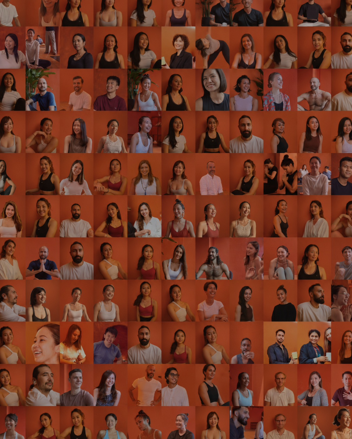
The perception of our brand generally came across as a place of calm. And while that is felt and experienced within our studios, it's also an environment filled with vibrancy, movement, energy, friendships, community, and amazing and interesting stories, all taking place in the heart of modern city life.
The process
We worked with the team at Obviously Studios. The brief was simple to communicate, but hard to get right: keep the warmth, lose the clichés, and give IKIGAI more confidence.
Seeing the first directions and hearing an outsider's perspective was eye-opening for us. Some early concepts felt too quiet. Some didn't feel like us. But after a few iterations, we got closer to what felt right.
Keep the warmth, lose the clichés, and give IKIGAI more confidence.
The idea behind it
We kept coming back to this: wellness doesn't always have to look soft, and quiet, and polished.
Life in Hong Kong is fast and full. We want IKIGAI to feel like a place to find a little more clarity, and space to move through all the momentum of city life.
The symbol
This is the first time IKIGAI has a symbol. It's made from four forms coming together around the centre.
It's built to represent the overlapping disciplines within our practice, and resembles vibrations and rippling energy, visually symbolising bringing the practitioner back to one's inner core, true self.
Conceptually, it's a lovely piece of thinking. It's essentially the visual expression of what the word IKIGAI actually means.
Having a symbol of our own gives us something recognisable that can live anywhere: on a piece of clothing, on a tag, on a studio wall.
The colours
The new palette moves between warm, earthy tones and brighter accents, giving us more room to express both calm and vibrancy.
The new typography and photography also give us more range. It's still IKIGAI. It just has a stronger way of expressing itself.
What comes next
You'll start to see our new identity across our studios, website, socials, classes, and soon our events and merchandise.
For us, this is a clear expression of who we are and where we want to go.